Related Posts

Super Hero Speak
A podcast for true comic book fans
A podcast for true comic book fans
By Matt Vroom
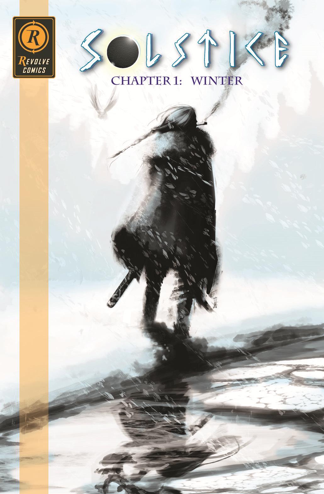
SOLSTICE: CHAPTER ONE, is the first in a five-issue miniseries from UK small press publisher, Revolve Comics. It was written by Danny McLaughlin, and artwork was done by Nathan Donnell.
Every once in a while we get a smaller publisher reach out to us to review their comics (which we TOTALLY want more of so please SEND US THOSE BOOKS!!!!) Then every so often one of those publishers sends us a nice little gem of a book, and Solstice: Chapter One definitely fits that bill.
At this point, I have read the first two issues of the series, and I am looking forward to reading the rest of this series. There were so many great things done in this book that I can’t help but talk about.
We are inserted into a world that is in perpetual conflict with mortals and gods. The one thing that keeps humanity’s destruction at bay is a herald that must live in a state between life and death. This is such an important role that it can only be entrusted to a bloodline full of women capable of carrying the burden.
Part of the interest I have in this book is the peril that each of the women who take up the mantle as the herald for the gods. Each of the chosen must go on a hero’s journey and conquer a plague that is set by one of the gods.
As they do so they are watched from on high from the deity who has dominion over the Earth. Hoping that the Herald fails on her mission to slay the beasts that represent their immortal masters.
I won’t spoil this issue or the remainder of the issues moving forward… but I feel like it is important to note that as each issue moves into another season of time you get an idea of how important the Herald is to the circle of life. Time evolves with the main protagonist, Finn, and we get to go along for the ride.
This comic fuses a coming of age story with a saga with deep lore that is complemented by the art and storytelling.
The color palette changes in each issue with colors that compliment the seasons. So, for example, the first issue was called “Winter,” and the colors it predominantly used were blue and white. The second issue, called “Spring,” used mostly shades of green. The third, “Summer,” used shades of orange, and the fourth, “Autumn,” uses purple as its primary character.
One of the great things that draw me to small press comics is their ability to experiment with the storytelling. They can afford to take chances that some of the bigger publishers can’t. I do think that the choice of the coloring gradually getting better as the story progressed works for this type of story.
Revolve Comics have a few other stories available on their website and Etsy account that you can purchase from them at pretty reasonable prices. Below is a list of sites and other social media accounts that you can check out to see more of their work.
https://twitter.com/RevolveComics
https://www.facebook.com/RevolveComics
https://www.instagram.com/revolvecomics/
https://www.etsy.com/shop/RevolveComics
I would say that some of the visuals in the comic might be more appropriate for older audiences. I never felt uncomfortable, but I’d definitely say that a teen+ crowd would appreciate it more than younger readers.
Thank for Danny from Revolve Comics for shooting us an email and letting us share your work to the Super Hero Speak community.
If you have a comic that you would like me to review, then please feel free to email me at matt@superherospeak.com, or Dave at dave@superherospeak.com.
Matt Vroom – Comic Reviewer for SuperHeroSpeak.com.
Follow Matt on Twitter: @vroomatt
See Matt’s Comic Book Work: Kickstarter for Super Elders #2 coming soon!
For latest news for Super Hero Speak, follow us on Twitter: @superherospeak
or Facebook: @superherospeak


")


