Related Posts

Super Hero Speak
A podcast for true comic book fans
A podcast for true comic book fans

Welcome to the show, children of all ages! Andy Larson back with another comic related way to get through your workday. That rhymes does it? I should have been a poet instead of a blog writer. Sipping Café au lait in some snobby coffee shop, letting my beard grow out into true lumberjack hipster greatness, looking down on the world from behind a pair of horn rimmed glasses. Not really contributing anything of value to the world, just being a pretentious white man in a pair of skinny jeans and argyle scarf.
Instead though, here I am, more of a hipster doofus that anything truly cool, in my worn old hoodie and Jack Kirby Machine Man t shirt. But at least I’m contributing something of value. Well…scratch that…quasi-value. Semi sort of value depending if you are bored enough to be reading along I guess. And that value is one of a comic book reader that tried to give you the skinny on some of the books I’ve been reading and whether it’s worth your time to pick them up for yourself.
In any case, today I thought I’d finally tackle that has been on my read pile for like 5 years now, but never got around to reading. I’m talking about the universally acclaimed espionage series “Queen and Country” written by Gregg Rucka. This book won the “Best New Series” Eisner Award back in 2002, and was nominated for a whole slew of other Eisners in both that year and subsequent ones.
The main story is about Tara Chace, an operative of the British Special Operations Section of SIS, also known as the Minders. At the beginning of the story, Tara is successful in assassinating a dirty foreign general with ties to organized crime. However, some of his criminal buddies don’t take to kindly to the Brits eliminating one of theirs and take it upon themselves to get revenge on Tara themselves. They do this first with a failed rocket launcher attack on SIS headquarters and then after that is unsuccessful, they attempt to try to kill her in her home. While the SIS wants to take these criminals out in retaliation, other government agencies within the bureaucracy want to take them alive as part of a prisoner exchange which ultimately leads to Tara being live bait for a group of trained killers, while the complex political story of the high stakes world of intelligence and counterintelligence plays out around her.

The end result is a dense, rich, gripping tale about the uberpolitical and often times dirty underside of what is normally portrayed in media as the glamorous, sexy spy world. Rucka took as his inspiration for the comic the ITV television series The Sandbaggers which ran from 1978–1980. That series created and primarily written by Ian Mackintosh, who himself was a former British Royal Navy officer, prided itself on showing a grim and morally ambiguous worldview, depicting the emotional toll taken on espionage professionals who have to operate in an ever increasing shades of gray. Good guys are rarely ever purely good, bad guys are your next door neighbors, everything shrouded in secrecy and double-dealing.
You can definitely see that Sandbagger influence throughout the book in that everyday heroics replaces the more grandiose James Bondesque thrills and chills. Tara, her fellow Minders, her superiors, CIA liaisons, MI6 liaisons all are painted as somewhat regular folks caught up in ever escalating web of conspiracy and ulterior motives. Tara’s boss, Paul Crocker, wants blood for the attack on this agents and after getting shouted down tries secretly working with the CIA to pull off the job covertly. However, as I said above that plan runs counter to MI6’s intentions of wanting Tara to act as bait to draw the terrorists out, making it pretty much clear they don’t really value whether she’s shot or killed in the process. I mean I’m not going to give away much more of the plot, because I couldn’t really do it justice compared to the actual book, but belive me when I say Rucka is a master of setting up the proper pacing and emotional resonance to really connect with the readers and make them care about the outcomes.
No wonder directors like Ridley Scott have been in the past attached to projects to bring this story to the big screen. This high tension cat and mouse game with not only the terrorists but the internal forces at work even within all of those that should be on the same side is riveting. It’s the stuff fans of Bourne Identity, or the new Jack Ryan show on Netflix eat up with spoons. It’s tailor made for the cinema and the modern day sensibilities of those that want a little bit more to their spy stories than giant laser beam cannons and massive explosions.

However, despite all my gushing over the quality of Rucka’s writing, I will say this book is not without flaws.
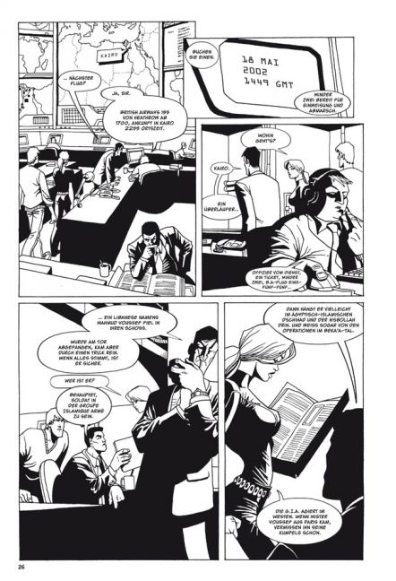
My main issue with this entire book is the art by Scott Roulson. I’m not going to say it’s bad, because it’s not. It’s a damn sight better than anything I could draw, but I’ll be honest, that’s not saying much. Although some would call it competent, with a book that’s clearly so very strong in terms of the narrative, this art in my opinion just does not cut it. This story deserves art that’s better than just competent. It should invoke the same feelings and dramatic action that the dialogue does. It just doesn’t fit the tone or intensity of the tale, especially when you compare it to the cover work.
Those covers done by Tim Sale are simply breathtaking and covey so much of the harsh gritty cloak and dagger type atmosphere that I was hoping I would have gotten from the rest of the story.

I mean, I won’t lie, when I picked up the book and saw those Tim Sale covers, I thought I was in for a modern day version of the old Modesty Blaise comic strips that I used to sneak into my older brother, Dave’s, room as a teenager and read. Something hyper stylish, laden in intrigue, suave and all together fascinating. I mean look at a sample of one of those strips below and tell me that doesn’t instantly deliver all the excitement and suspense that a spy book is supposed to!

Instead I feel like I was reading a spy version of the Simpsons just based on the art.
Everything looked so cartoonish. Almost caricatures of real human beings instead an almost photo realistic style that I feel like this story demanded. My wife used the term “juvenile” when describing it, and although I don’t think I’d go that far, it did look unpolished and boring, especially in the panel and shot layout selections.

And god, sometimes it was so hard to tell who everyone was at times as a result. I mean obviously you can tell which character is Tara Chance, but I swear her boss, Paul Crocker and another one of the minders, Tom, with dark hair, they just looked like slightly different doppelgangers of each other. Even Paul’s boss, Deputy Chief of Service Donald Weldon, looked pretty much like Paul, except for that Reed Richards white hair ring along his sides.
Were some of these characters supposed to be older than the others? That’s not very clear. Is anyone supposed to be attractive or are they all so plain looking? That’s not very clear either. Everyone looked either squat/short or thin/lanky. I’m not saying that people in comics need to be beautiful or ripped as hell with muscles, but you’d think in a world of high ranking agents performing assassinations and such, that someone would. Thank God they gave the guy from MI-6 a mustache so he was actually distinguishable in some way or I would have just thrown in the towel.
And I hated the noses. I don’t know what it is about drawing a decent nose, but this book had some of the worst. Either too large or unnecessarily hawkish.

If it sounds like I’m being so overly critical of the art, it’s because truly I disliked it so much that it in some ways completely soured me to Rucka’s wonderful story. Just like back in the day when it was so difficult to read the brilliantly written 90s X-Factor by Peter David because the Larry Stroman art was just so rough in my opinion that can really turn someone off as fast as a horrible smelling fart on a first date. And that’s what’s happened here. I’m not saying it’s bad enough that I won’t read more “Queen and Country” going forward, but I will say that it took what should have been an “A+” book in terms of that writing and dropped the book several grades in my eyes.
Luckily this is the only book of the series illustrated by Mr. Roulson, and it seems like each trade from here on in looks more like the kind of art I expect from a series like this. Especially for the 3rd trade, Operation Crystal Ball, with art by Leandro Fernandez. Hot Damn! That’s pretty, pretty, pretty stuff right there! See that wasn’t so hard, comic book series! You should have just given me this caliber from the start!
(Yeah, that’s nearly a four grade drop from an A+ because of the art)
")

")

")


